|

Watercolor Animals

ART 2
Kandinsky Watercolors
December 2019 Embossing Art

ART 1
DECEMBER OPTICAL ART
ART 2
DECEMBER FLOWER DRAWING
![]() 
Sept 3rd
Art 1 and 2
Grid Drawing
Term s s
Foundation
Proportion
scale
The Cast Shadow- This is the darkest dark. It is the shadow that is cast by an object on a surface that it is laying on. The cast shadow is the darkest where the object and surface touch, and will get lighter as it gets farther away from the object.
- Shadow Edge- This value is on the opposite side of the light source. It is not the edge of the object.
- Mid-Tone- This is what the actual color of the object is, without any effects from light or shadow.
- Reflected Light- This is the light that is seen around an object, usually between the cast shadow and the shadow edge. It's the light that is bouncing off of the surfaces around the object. This value is never bright white. When drawing in color the reflected light will contain the color of the object or surface closest to the object your drawing.
- Full Light/Highlight- This is where the light source hits the object at full strength. It is usually shown by the white of the paper. All the areas of gray around the full light should be blended so that there is a smooth, gradual transition between them.

Imagination Drawing
Terms
Line
space
perspective

Thursday MAy 16th
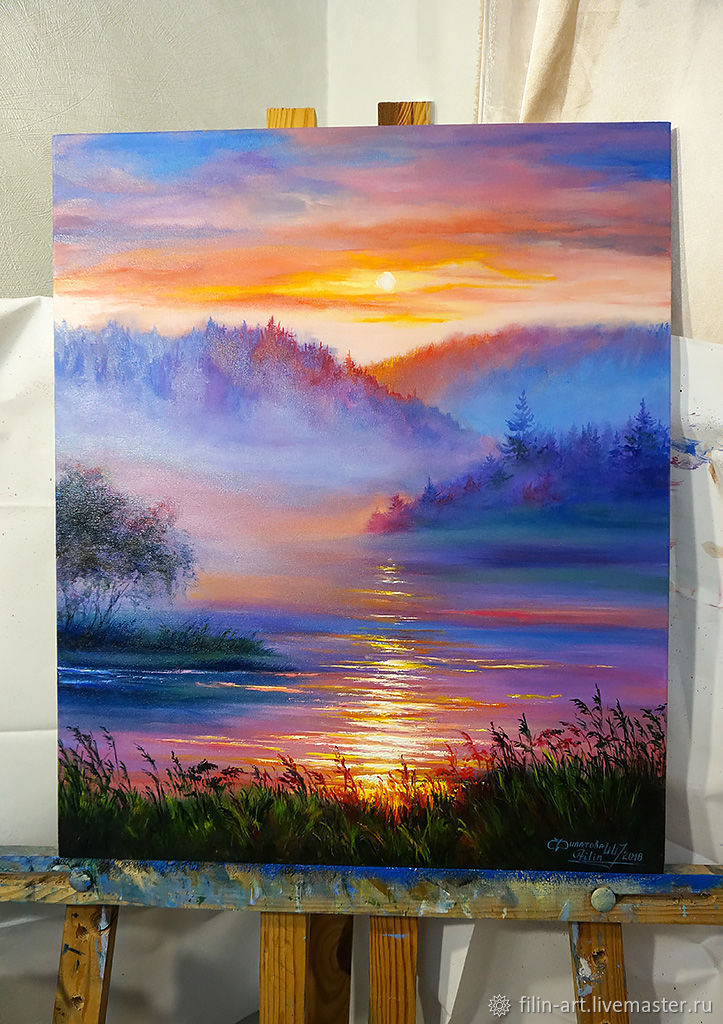
Mini watercolor paintings

Week of MArch 29th

Week of Feb 25th
Students will continue working on their one point perspective drawings
Week of January 28th
Students will continue working on their Zentangle designs. S
Terms and Elements of Design
Repetition
Pattern
Art Week of 2/ 25
Students will continue working on their one point perspective drawing.
ART 1
Week of Wednesday Jan 21st
Students will learn about the Pittsburgh artist Andy Warhol and continue working on their Pop Art desgins.
The students will create a acrylic painting of a famous Pop Art design. The designs will be drawn to scale using the
Grid Drawing method.
Terms: Commercial Art, Pop Art, Posterize, Andy Warhol
Week of Janruary 1st
ART 2
Continue Clay Flower Project

ART 1

Week of Monday December 17th
Week of December 3rd
Art 1 and 2 Students are starting Prisma color drawings
Students will use prisma pencil to draw Poinsettia flowers
Week of November 19th
Students will design a district Holiday card.
The winning design will be featured on this years Greenville School District Holiday card.

Week of November 12th
Art 2 Oil painting
Students will learn different methods and techniques of oil painting.
Color mixing
Blending
stipple
dry brush
Week of 10/29
Art 1
3D Art sculpting in clay
Week of Oct 22nd
Start Reverse Drawing
Term- Dramatic Contrast
Week of Oct 15th
Art 1 and 2 Pointillism

Monday
Sept 24

Week of Sept 17
Art 1 and 2
Prismacolor Drawings
Students will be introduced to Prismacolor Pencils and color blending techniques with the prisma. During this project students will learn the secerets to make an image pop and stand out.

Week of Monday Sept 10th
Art 1 and 2
Chalk Pastel drawing
Student will create chalk pastel flowers in the style of artist Georgia Okeefe
Terms
Complimentary colors
color blending
vibrance

Week of Tuesday Sept 4th 2018
Art 2 Facial Proportion Project
Terms
Line
Value
Texture
Contrast
Students will create a realistic drawing of a person using the Grid drawing method
Week of 8/27/18
Art 1
Objective- Students will be working on realistic pencil drawings of animals.
Terms for this assignemnt:
Proportion
scale
value
contr ast ast
Example Drawing
Monday May 14th
Art 1
Drywall Relief Carving
Ordinary to extraordinary designs
Art 1 and 2 Students will start Hand Projects and complete notan art.
8th Grade
Students will start clay mug designs
Art 1 and 2
Monday March 19th
Students will start Positive and Negative shape designs.
Students will learn about Notan- Notan is the Japanese design term that describes the relationship
between dark and light contrast work of art.
Feb 26th
Art 1
Students will start mixed media drawing
Students will continue Disney cartoon designs on masonite panels
Week of January 22nd
Students will start Coffee paintings
Students will create a monochromatic painting by diluting instant coffee with water.
Elements and Principals of Art
Line
Contrast Value
Start Pointillism project
Wednesday Jan 3rd
Continue Pointillism
Tuesday Jan 9th
Art 1 and 2
Monday December 18th
Watercolor Holiday Cards
Monday Dec 11th startGlass etching
wood burning
Art 1 Flower Paintings Tuesday November 28th
Students will use their primary colors to create a painting of flowers.
The focus of this project is color recognition and color mixing. Students will understand how to recognize warm and cool colors. Students will learn how to adjust their colors to match a desired tint.
terms
Primary colors
warm color
cool color
compliment
horizon line
contrast
Week of Monday November 13th
Art 1 Licence Plate Designs
Art 2 Reverse Drawing
Art 1
Pablo Picasso Lesson
This class will learn about collage and the art of Pablo Picasso
Students will create a collage using wallpaper donated by Packard Paint in Greenville
Week of October 16th
Starry Night Art
Students will learn about Expressionism and the art of Vincent Van Gogh. Students will create their own version of the painting Starry Night. During this process they will understand that color and line have the ability to convey feeling.
Week of Monday Oct 2nd
Students will begin Prisma color drawing
Monday September 18th 2017
Art 1 and 2
Continue Chalk Pastel Painting
Terms
color wheel
complimentary colors
contrast
silhouette

Week of Monday September 11th
Art 1 and 2
Students will continue working on a grid drawing and proportion project. Students will learn about how to scale a photo reference in the artwork.
Terms
Proportion
scale
Gradation
8th Grade Art
Students will continue working on a Graffiti Drawing project. Student willClearn how to make block letters and blend colors within their work.
Terms
Line
Pattern
Complimentary colors
Art 1 and 2
Week of Monday May 22nd
Students will start still life drawing
Spring Flowers
Students will make flowers out of clay.
Art 2
Paint ceiling tiles for the Backpack program and Paint the Plow project
Prepare and set up for the Art Show on Wednesday
students will complete their projects and set up displays
Start Prismacolor flower drawing
Art 1
Students will start Cubism Chalk Pastel drawings
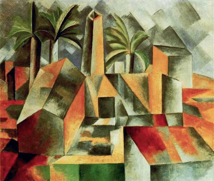
Terms and Atist
Cubism
Picasso
Fracturing
multiple perspectives
Start Recycled/repurposed Art

Terms
Balance
Symmetry
Unity
2,3,5
Art 1 and 2
Monday Feb 28, 2017
This week Students will start monochromatic paintings in watercolor. We will talk about color and mood/feeling in art. A example is Picasso's Blue Period where he used a monochromatic palette to demonstrate his feelings.
Students will create a monochromatic painting of themselves starting today. We will discuss facial proportions at the beginning of this assignment.
This week we will start creating Art out of old electronic devices. Students will make sculptures and jewelry out of garbage.
Students will also finish reverse drawings.
Monday Feb 13th
We will start Reverse Drawing
Reverse Drawing is a Art technique in which the artist applies light over a dark background opposed to dark over a light background. The finished piece in a reverse drawing typically has more dramatic changes in contrast.
Terms
reverse drawing
contrast
silhouette
contour
dramatic lighting
romantic period
Monday January 30th
Students will start a Oil Painting project
Terms:
Fat over Lean- Heavy bodied paints over Thinned paints
Impasto- building heavy layer of texture with the paints
Scumble- Typically used to produce highlights in a oil painting
Turpentine- used to thin oil paints
Painting knives- used to produce special effects including a impasto finish.
Underpainting- the preliminary layer in a painting.
Bob Ross Landscapes
Color mixing
Gradation
Oil vs Acrylic
Students will continue to work on their glass etching projects and start into relief carving on wood.
Etching and Carving projects
Monday December 19th
Ceramic Trees

ART 1
Black and White Pointillism Project
George Seurat
Picasso Collage
Students will create a collage out of wallpaper donated from Packard Paint
Foam Board model houses

Monday October 24th
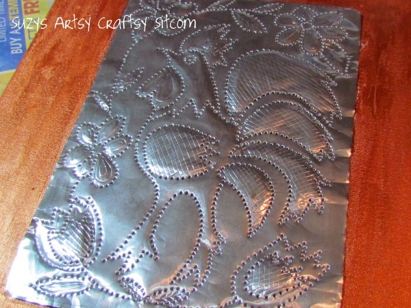
8th Grade Foam Embossing
Subject-
Foam Embossing
Students will learn about printing and embossinng. Students will create a detailed repetitive design on their foam board and print the design. We will discuss the popularity of vera bradley purses and the importance repetition and pattern in their designs.
Terms
Balance
Repetitiom
Symmetry
Looking ahead-
This project will prepare students for more advanced printing methods. Students will understanding that lines define form in a print.
Monday 24th ARt 1 and 2
Architectural designs
Art 1 and 2 Painting and Color
Students will create a Acrylic painting and learn the basics of color mixing and color theroy
To mix color you have to have a basic knowledge of color theory and a hands-on understanding of how paint colors behave with each other. It is important to understand that when mixing paint, as you are creating a painting, you draw upon your knowledge of color theory and your understanding of how paint colors behave; however it is more of hit and miss and try again to achieve the right color.
Studying the color wheel below is a good place to start learning color theory. The first thing you should note is the primary colors: Red, Yellow and Blue.
Primary Colors
Theoretically all colors can be mixed from these three colors. However theory and practical application are very different. If you were to ask what is pure yellow? I would have to answer “ the absence of red and blue”. The same would be said of pure red, it is the absence of yellow and blue and pure blue is the absence of red and yellow. To simulate the primary colors in the color wheel below I used warm and cool hues of each color. For primary Yellow I mixed Cadmium Yellow and Lemmon Yellow. Mixing Cadmium Red and Alizarin Crimson to create a primary Red and the Blue by mixing Phthalo Blue and French Ultramarine.
An example of why it takes two color red paints to achieve a color closer to a primary red, Cadmium Red paint is a warmer red as it has more yellow then Alizarin Crimson paint, which is a cooler red with a blue under tone. By adding them together in almost equal proportions you begin to nullify the yellow and blue in each resulting in a color that is closer to a primary red.
The idea of warm and cool color is critical to understanding color theory and practical application of paint. It is important to have a basic understanding of color theory and to spend time mixing and experimenting with the paint you are working with.
Secondary Colors
The next thing you should notice in the chart is that between the primary colors are the secondary colors. If you look between two primary colors you will see a secondary color. By mixing any two primary colors you will get a secondary color: Orange, Green, and Violet.
Here is how it works; by mixing the following primaries you will create secondary colors:
| Red and Yellow (primaries) = |
Orange (secondary) |
| Yellow and Blue (primaries) = |
Green (secondary) |
| Blue and Red (primaries = |
Violet (secondary) |
Complimentary Colors
Another important aspect of color is to understand complimentary colors. Complimentary colors can be found on the color wheel by looking directly across from one color to the color on the opposite side of the wheel.
The following are the basic complimentary color pairs:
| Primary Colors |
Complimentary Colors |
| Yellow |
Violet |
| Blue |
Orange |
| Red |
Green |
Complimentary colors are very important in painting. They can be used to increase the intensity of each other when placed side by side. An example would be orange with its complimentary blue next to it, it will look much more intense then if surrounded by white. Another important aspect is when compliments are mixed together they create rich neutrals or grays. With a small amount of one mixed with the other you can achieve shadow tones.
Week of Monday Sept 26th
Students will learn how to critque this week.
Start Chalk Pastel Project

Art 1 and 2 Prismacolor drawing Project Week of Tues Sept 6th
Intro to color and Blending
Color, Primary colors, Secondary colors
Watch blending with Prisma
https://www.youtube.com/watch?v=nrQLUAkgegk
Art 1 and 2 Week of August 30th
Students will learn about the Principle of Art know as Contrast and its importance

Contrast is really important when you’re starting to learn how to paint.
A good knowledge of contrast in drawing helps significantly because you will have learnt the value of light and dark.
If you are coming from a non-drawing background, you will have to be more aware that to make a dramatic painting “contrast is king”, rather than trying to add a bright colour to lift the painting…
Pencil vs paint
Contrast is somehow clearer to understand in drawing because you have a white piece of paper and a dark pencil, It feels natural.
If you transfer the same level of contrast to painting it can seem daunting and the areas of dark can look too heavy. However, it’s very important to have a range of contrast in your paintings from black to white to truly show off the colours.
Art 1 and Art 2
Week 1 August 24th
Proportion and Grid Drawing

ART 1 and 2 Week of Mon Monday May 23rd
Students will continue colored pencil drawings and finish all incomplete work from this year.
Students will start Art Nouveau Colored Pencil Drawing
ART 1and 2
We will have a guest artist on Tuesday this week and the students in Art 1 and 2 will learn about the oil painting medium. Students will experiment with techniques and application of oils.
Start Pointillism project
optional crayon drip for non pssa students
Drywall Relief Carving
Relief carving as a type of wood carving in which figures are carved in a flat panel of wood. The figures project only slightly from the background rather than standing freely. Depending on the degree of projection, reliefs may also be classified as high or medium relief.
Relief carving can be described as "carving pictures in wood". The process of relief carving involves removing wood from a flat wood panel in such a way that an object appears to rise out of the wood. Relief carving begins with a design idea, usually put to paper in the form of a master pattern which is then transferred to the wood surface. Most relief carving is done with hand tools - chisels and gouges - which often require a mallet to drive them through the wood.
Expressionism Art
Paintings like Van Gogh’s ‘Sunflowers’ (1888) opened our eyes to the intensity of expressive color. He used color to express his feelings about a subject, rather than to simply describe it. In a letter to his brother Theo he explained, ‘Instead of trying to reproduce exactly what I see before my eyes, I use color more arbitrarily to express myself forcibly.’ His heightened vision helped to liberated color as an emotional instrument in the repertoire of 20th century art and the vitality of his brushwork became a key influence in the development of both the Fauves' and the Expressionists’ painting technique.
Students will create their own expressive work of art.
Students will not try to reproduce what they see but instead they will produce what they feel with color and design.
Decorative Art
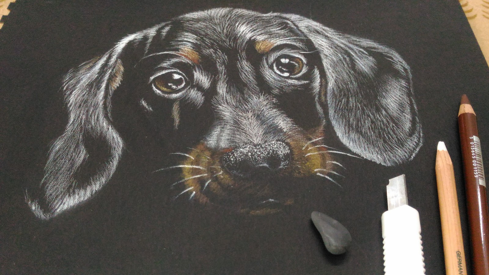
Reverse Drawing

Using contrast in a drawing is a great way to create a Dynamic image. One way to create high contrast is to use a white medium on black paper.
Terms
Contrast
Continue pastel landscapes and start Decorative Art Project
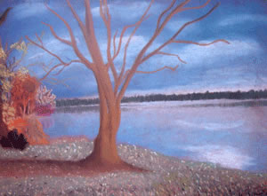
Pastel Landscapes”
Landscape drawing is a great way to teach students how to create the illusion of space. It is also a good way to introduce students to chalk or soft pastels. This lesson is great for beginning artists in a high school or middle school level.
Class Level: Art 1
Overview and Purpose: Students will review the use of several factors to create the illusion of space in a 2-D image. Students will learn to use color to create the feeling of a particular mood. Students will review the use of chalk pastels in the creation of artwork.
Materials:18” by 24” Toned paper, chalk pastels
Objectives: The student will learn the relationship between color and mood. The student will review concepts necessary for creation of the illusion of space on a 2-D surface. Students will learn the relationship between horizon, background, middleground and foreground. Students will review the successful use of chalk pastels on paper.
Decorative Art
Decorative Painting was popular in Europe in the 1880's
1.) Decorative painting celebrates pattern and ornament
2.) It challenged the divide from Art and Arts and crafts
3.) The works complimented the interiors from which they were commissioned
Students will create a decorative painting of their own for this assignment.
We will emphasis pattern design and repetition in the work.
Perspective Drawing
Students will begin a lesson on perspective drawing. Students will learn 3 kinds of Perspective.
After learning three ways to draw perspective students will pick a famous work by the Artist M.C. Escher and replicate elements of that work.
Terms
1 point perspective
2 Point Perspective
3 Point Perspective

Art 2

Students will begin a lesson on perspective drawing. Students will learn 3 kinds of Perspective.
After reviewing the three basic types of perspective drawing students will created a 3 point perspective drawing of their own.
Terms
1 point perspective
2 Point Perspective
3 Point Perspective
Art 1
Week of Monday December 21st
Students will create a collage out of scrap wallpaper. The will discover the importance of pattern and contrast in order to create a successful design.

Art 2 Week of Monday December 21st
Students will finish Pointillism this week and start making burlap wreaths
How to Make a Burlap Wreath
What you need:
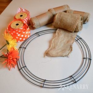 1 – 16″ wire wreath (You could also use an 18 inch wire wreath 1 – 16″ wire wreath (You could also use an 18 inch wire wreath , but I would add at least a few more yards of burlap if you want your wreath to have a fuller appearance like mine.) , but I would add at least a few more yards of burlap if you want your wreath to have a fuller appearance like mine.)- 60 feet of 5″ wide burlap ribbon or garland
 (20 yards) (20 yards)
- 1 – 18 foot spool of 2″ wide orange polka dot wired accent ribbon (9 yards)
- 1 – 18 foot spool of 2″ wide orange chevron wired accent ribbon (9 yards)
- 3 artificial accent flowers
- Twine


|